It goes without saying that colors can highlight any design with its exceptional features and strengths. That is why the proper pallet and patterns matter when it comes to the excellent app interface and brilliant user experience. The Multiplyten team is ready to share the most helpful tips related to the selection of the best-matching colors for your digital products.
Roles of Colors to Consider
Four important roles color pattern designers should take into consideration. This is a basic for a great app or game look finally. These four roles are:
- Game mechanics are highlighted with the suitable color pallet you choose for your design.
- Visual clarity is achieved with the help of matching color combinations.
- The user’s attention is paid to the focus features of the digital product with the help of color patterns.
- A better emotional connection with the app, game, and your devs’ community is reached through this approach.
It means that color variations and blends of different patterns can bring visual harmony and increase UX background greatly. If you want to achieve the best design results and bring all the above-mentioned roles to action, it is better to take a closer look at the interesting tactics most renowned designers use.

Color Gradation and Levels of Color Strength
One of the win-win tactics is to create visuals according to the so-called theory of color strengths. Each one obtains its level of power and sense to consider. If you are ready to create a fantastic digital product, the following tips related to this very topic will come in handy:
- The most powerful colors for designers are yellow, red, and blue. They are mono patterns with poor combinations with other pallets and gradations. Note this rule while designing an app or other entertainment-focused products.
- Among secondary-level colors are purple, green, and orange. They are used often to create perfect combinations with top-level color patterns. Any shades and variations of the above-listed colors are loved by designers for their various mixing strategies and bright performance when it comes to the interface.
- Together with primary counterparts and ones of the second level, there is a third group of colors to take into account. They are used to highlight the general mood and sense of the app interface and complete the ready-to-use pallet for the digital product (e.g. yellow-orange, yellow-green, etc.). Combine everything properly to make an accent on the desired emotional connection with your target audience.
- Speaking about tertiary colors, it is necessary to review the most popular combinations of colors that promote specific emotions. For example, burning and flaming compositions like yellow-orange, red-orange, and red-purple make users more active and are usually used for CTAs and other banners to make more conversions.
Warm but calm color combinations like blue-green, purple-green, mono-purple, and yellow-green can promote peace, confidence, reliability, etc. But be sure that there are many other interesting variations related to the type of your business or goods & services you are going to offer via the application or other web resource.
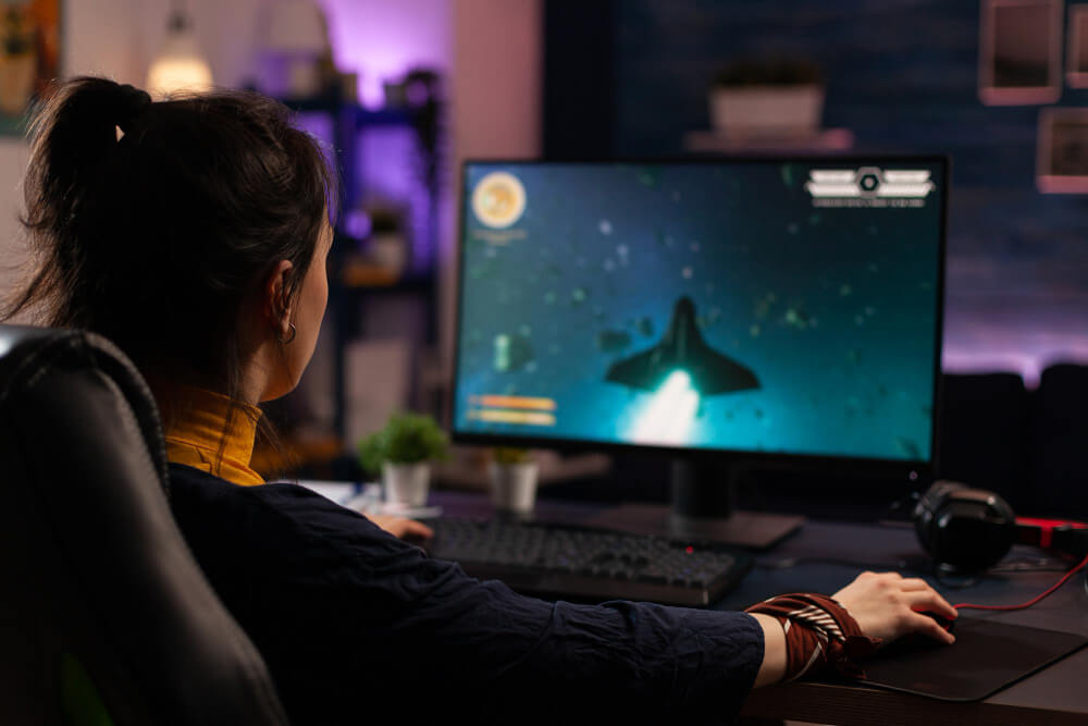
What About the Gaming Industry Color Trends?
The gaming industry prefers to call these levels the components of the ever-rolling color wheel. Where the circular pallet representation takes place. This way you can count on the marvelous color mixes, perfect design solutions, and a visual background that is pleasant for the human eye.
Remember that color harmony and the focus on color pattern meanings can awaken subconscious feelings and activities from users. It means that your game can attract even with one demo, logos, icons, and other visual content that is made of colors and branding elements only.

Keep track of the Multiplyten blog posts to find out more and more recommendations concerning the gaming industry, design trends, publishing techniques, and many more we make a specialty out of.